Saturday, January 12, 2008
500mb HEIGHT ANOMALIES
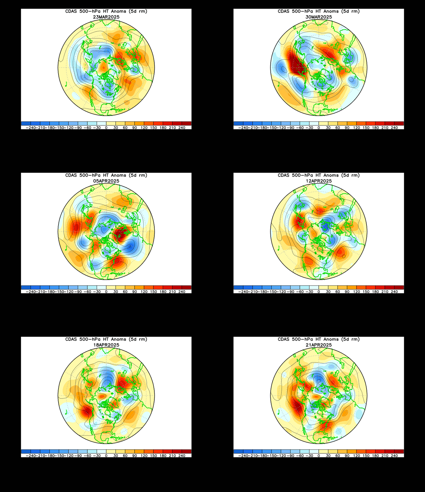
This is an animation of height anomalies of the 500mb pressure surface. Area's of red represent higher heights which correlate with warmer than average surface temperatures. Conversely, areas of blue represent lower than average heights and correlate with cooler than average temps. Note how a large area of red pushed in about a week ago. This was our big warm-up, which ultimately contributed to a round of severe weather. Just at the end of the loop, check out how there is a large area of blue diving in from the Northwest. This area of lower than average heights will be with us through the week and may contribute to some mid-week snow.
Posted by Ted Zarras at 8:27 PM

0 Comments:
Post a Comment
<< Home